
The Art of Descent: Legends of the Dark
A Conversation With the Art Directors and Artists
We’ve been introduced to the sprawling, mystical landscapes and inhabitants of the world of Terrinoth. We’ve visited the ancient ruins and cursed forests in Descent: Journeys in the Dark, and the Free Cities and the Mistlands in Heroes of Terrinoth. But we haven’t witnessed Terrinoth in the way we’re about to in Descent: Legends of the Dark. So, we wanted to start at the beginning and explore the art style and how it helped tell the story in this newest addition to the realm of Terrinoth.
We recently spoke with Art Director Tim Flanders, who gave us an overall perspective on the project; Art Director and Artist Preston Stone, who in addition to art direction, focused on the character and weapon art; and David Nash, the artist who created two main art pieces for the game. Read on for our conversation about the art of Descent: Legends of the Dark.
Let’s start at the beginning. How would you describe the artistic style used in Descent: Legends of the Dark?
Tim: So, to push the narrative of the new storyline, we really wanted a style that let us depict a familiar setting in an unfamiliar way. Descent has been around for quite some time, and its visual style has been constantly evolving the entire time, but one of the hallmarks of the Descent art has always been a slightly exaggerated, whimsical use of proportions and characterization. From the earliest days of Descent First Edition, Jesper Ejsing’s art really defined the setting of Terrinoth, laying down the visual foundation for a high fantasy game, with expressive and exaggerated characters, but always with a hint of something darker. We wanted to honor that legacy with Legends of the Dark, to make something that was identifiable as—no pun intended—descended from the earlier games in the setting, but wholly its own.
For that reason, we chose to continue in the vein of whimsical and exaggerated proportions in our characters and creatures, to let that be our point of connection to the previous titles. But we thought we’d take it a step further and push the actual line and rendering style away from the more traditional roots. For Legends of the Dark, we wanted to lean into an almost cell-shaded rendering style that really featured expressive line work over detailed, realistic texturing. We also wanted a color pallet that would support the story themes of change and a darkness looming on the horizon. With those story elements in the front of our mind, it was clear that a more somber, autumnal pallet would sell that idea in a subtle and engaging way.

Descent: Legends of the Dark is a new look into the world of Terrinoth that features cooperative gameplay, and a storyline with heroes we haven’t encountered before. You’ve touched on this already, but can you explain further how the art evolved from previous titles?
Tim: One of the things we wanted to do with the art in Legends of the Dark was show a different side of Terrinoth. Historically, the art for Descent games has really focused on high-fantasy adventures. While many of the heroes of previous Descent titles had a darker edge to them, the overall tone was always one of high adventure, and the art very much fit that more heroic tone. That fits quite well with the more open-ended narrative of a band of heroes chosen by the players going on all manner of quests throughout Terrinoth.
With Legends of the Dark, we knew going into it that this was going to be a more contained, focused narrative; a continuous storyline that featured those same characters throughout. We also knew this story had a bit of a darker edge to it, depicting a time of strife and upheaval for the characters and peoples throughout.
So, for all those reasons, we really wanted to build that narrative into the art. The heroes are all at the beginning of their quest, and they will grow and change throughout the story. While many of the enemies are familiar, their new design hints at how they fit into the ongoing narrative. Even the environmental elements like the board tiles and terrain depict this ongoing, twilight narrative.
Let’s talk about the enemies. There are some classic villains used in this game. What did you do to bring the villains to this new art design?
Tim: This was one of the most enjoyable aspects of directing the art for Legends of the Dark. The most important thing we focused on was making sure that even though they were being depicted in a new style, these characters would be immediately recognizable to the viewer. This process was two-fold. The first is obviously the physical aspects of the character, such as their clothing, their weaponry, and any other iconic elements of their visual depiction. For instance, Baron Zachareth has been depicted in a number of our games set in Terrinoth. Physically he is most well-known for his distinctive magical tattoos, his villainous goatee, and his long, widowed-peaked hair. In his depiction in Legends of the Dark, we had to make sure to include all those iconic details.
However, the second part is in the personality and attitude. Those recognizable physical details would be extremely jarring if Zachareth was acting out of character, so his posture, facial expression, and demeanor all have to have that same smug, dismissive confidence that makes the viewer question whether he is truly friend or foe. Once we had all of those characteristics identified, it was simple matter of providing those thoughts and references to the new artists, who had already really mastered the specific visual style. The level of creativity and adaptability these artists have is incredible and they were able to reimagine these characters flawlessly into the new visual style.

And now switching to heroes. Can you talk about the artistic style continuity between previous heroes and the new heroes?
Preston: Stylistically, we were really aiming to create something new, but the design choices made for the heroes and even most of the enemies were informed by previous Terrinoth art such as Descent, Runewars, the Genesys RPG: Realms of Terrinoth, and so on. The philosophy with each character was, “Okay, here’s all of what we’ve done for this type of character in the past. How do we make this new character as unique in silhouette and full of personality as possible, while keeping some of those key aesthetics that make it fit in Terrinoth?”

Galaden is a good example of this. We wanted the through-line from old to new be the clothing choices: leather with gold decorative elements, fur, and long flowing forest green fabric. From there we wanted to push the anatomy, silhouette and details as much as possible in a way that told a story with the character and also helped make the character easily identifiable. Galaden is a physically strong Elf who has been through a lot of trauma and is now deaf. The trauma shows on his face and in his gaunt physique. His stance is nevertheless leaning forward, showing that he’s willing to face any danger despite what he’s been through, and finally, his eyes are wide, indicating an intense use of his remaining senses.
Knowing this game was going to have an app component, how did that affect the way the different elements such as characters, villains, and lore were created?
Preston: All of the heroes and enemies are animated. This was something we had to plan for early on. Art that normally would have been one drawing had to be pieced out and layered for our animators to be able to rig and move around in the app. The weapons were also a little different than typical weapon art. We knew the players would be able to mix and match parts of each weapon, so all the pieces were made separately as opposed to being one singular design.
Tim: Honestly, the app integration is probably what really pushed this game as a truly narrative experience. The app allowed us to include a handful of interstitial motion graphics to depict the most dramatic moments of the narrative as it unfolded during the table-top gameplay. These motion-driven sequences really gave us the opportunity to punctuate the story in an immersive way. Obviously, I’m a huge fan of still art and think that the storytelling of still images is almost limitless, but one thing it can’t do is pull the viewer into it the way that moving imagery can. With the animated cut scenes, we can really immerse the players in the world where their story is unfolding, to tell stories that progress and change in real-time. This gave us and the writers a huge opportunity to create a narrative with real impact and let the players connect with their characters’ lives in ways we’ve never really done before.
Because of so many elements to this project, a sizable number of artists were recruited. Can you talk about the process of choosing the various artists who ended up working on the project?
Tim: We—Preston Stone, Andy Christensen, and myself—spent the first few months of development hammering out the specifics of the art style we wanted to pursue with this game. After we had the key points determined, we spent another few weeks individually combing through artists with whom we had worked with in the past that we thought would fit the new style well, especially those who we felt would enjoy the new style, as it was something we’d never done before. We also wanted to include artists who were entirely new to us. We each made extensive lists of artists whose online portfolios showed that they had an inclination towards one or more elements of the visual style, especially those who showed a great deal of stylistic flexibility. A few of them had already served as inspiration to the new art style—like João Bragato.
Preston: João Bragato was a person we were looking at when we were still thinking about what style to do for this game. After we landed on the style that his aesthetic fell within, we knew he was going to be the perfect artist to handle the enemies in the game. He did an amazing job revitalizing the visual look of classic Terrinoth monsters and was able to come up with designs that felt unique to the setting. The Fae in particular felt to us like, “for the first time, this looks like it should.” The Fae are meant to be weird creatures from an alternate plane of existence, and these were actually weird enough to capture that feeling.
David Nash, you were one of 17 artists recruited for this project. David, what was your process for creating the cover art and the decisions you made on the art piece itself?
David: It was a very large series of images, including the outer box and inner, stained glass sections. These two components required two very different processes, but ultimately, it’s all about breaking down the large tasks into manageable pieces.
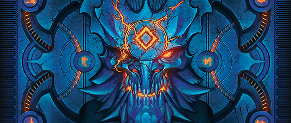
 For the inner box, the sketch process focused on placement, so that every element was included and visible. There is a lot of lore represented on the inner box, so making sure it all had a place and kept balanced was a big challenge. I also had to experiment with the actual painting process to achieve the stained-glass appearance: researching how stained glass is made and finding my own method to convey the style.
The outer box had a very different set of challenges. The design team at FFG had already landed on a basic layout and color scheme, but it was up to me to develop all the little details. It had to feel like a heavy, stone puzzle box, and it took some time to develop something that looked intricate and still focused. After that, it was just a lot of painting to get all those cracks, grunge, and luminance.
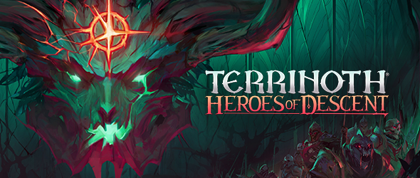
The Lore Guide cover is an intricate art piece. Walk us through the range of elements used and the decisions made on what was included.
David: There was a lot of amazing character artwork that João Bragato, Ivan Dedov and Preston Stone had already made for Descent: Legends of the Dark. Bringing together so many of those ideas, the style, and the energy into the lore book cover was complicated. Simplification was necessary. There are two major ways I did this. One was with the color scheme: blue background, red foreground, yellow focal point. The second was in the compositional structures, specifically that the heroes are contained in a nice triangle, sandwiched between the blue sky and red ground. Unifying all those monsters under one color helps to subdue their visual weight so our heroes can shine. Then there was lots of tinkering and adjusting the various poses and pointy bits until everybody settles comfortably into place. A final, little punch of red fog so the big, bad guy can look ominous, and we’re done.
Because the box art and lore guide are central art pieces for this game, did one piece influence the other?
 What was your process for creating both pieces knowing the two would need to complement the overall art style and one another?
David: Finding continuity between the box and lore book relied on following the example of the established art. That involved imbuing the main characters with a lot of flow and using a hybrid cell-shaded rendering style. Once the image style is consistent, then I had to work in visual callbacks to tie the pieces together. The inner box was a big part of that. It is a tribute to all the lore developed for the game and working on it immersed me in that lore. With that experience, it was a simpler process to represent those elements on the lore book cover. Lastly, there’s got to be stained glass somewhere. That’s an easy win.
To find out more about Descent: Legends of the Dark, visit our announcement article here. You can pre-order today at your local retailer or online through our webstore! Descent: Legends of the Dark hits shelves in August 2021.
Related Products
Related News
Terrinoth: Heroes of Descent
Announcing a Brand-New Dungeon Crawler Coming to PC, Mac, and Consoles This Spring

